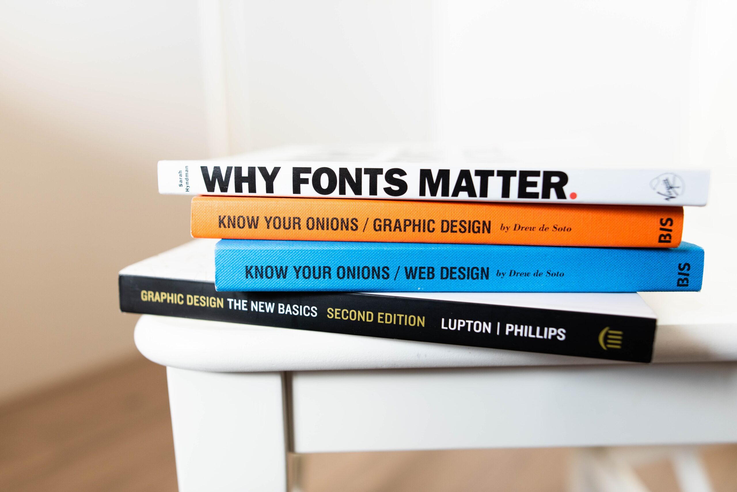
In An Introduction to and Strategies for Multimodal Composing, Melanie Gagich says that “when you communicate using an essay, you are actually using three modes of communication: linguistic, spatial, and visual.” Obviously, “show, don’t tell” need not apply with a predominantly text work. That said, there is definitely a lot of showing involved with an essay. You could use images to make a point, but how professional your work looks is important. That’s why I’m thinking about Comic Sans.
In Beyond Black and White, Michael J. Klein & Kristi L. Shackelford provide guidelines for readers to spruce up their essay’s visual prowess. They discuss how repetition can link ideas, and they go through the basics of alignment. They also touch upon fonts. They don’t do so for long – at most, they say that MLA requires a serif font like Times New Roman at 12-point font. Yet, it got me thinking about what fonts say about a piece. That’s why I’m thinking about Comic Sans.
The moment I put two and two together, the combined message of these pieces immediately clicked. Nothing communicates the importance of visuals in a text like knowing what fonts can do to your tone. Times New Roman, for instance, is a safe choice because it’s easy to read and it looks professional – neutral, even. The moment a serious work – or anything with weight attached – uses a font like Comic Sans, it simply loses all power. You can’t take it seriously anymore.
I know why Comic Sans exists.
It was initially made for a failed Windows client called Microsoft Bob, which aimed to make computing seem easier with a friendly, cartoonish aesthetic. It didn’t make it to the final version. So, it made a debut with Microsoft 3D Movie Maker – an application specifically for children (even then, still looked back upon more fondly). With that in mind, the comic lettering-skewing font still permeated professional settings. It is an easy-to-read font, and it does honestly hold more appeal than many of the other garish default fonts in Word. But an essay, a dissertation, a report is one Crtl-A, “Comic Sans” away from looking completely ridiculous.
There are certainly times and places to be using Comic Sans. A piece with a playful tone or an ironic slant could benefit with it over Times New Roman. You do you. Still, just keep in mind that how your work looks can easily diminish or trivialize the tone of the hard work you’ve toiled away at. That said, it can also enhance and strengthen your hard work. It’s something to keep in mind when diving into the word of writing: words simply aren’t enough.


Leave a Reply